Aspect Ratio Calculator & Image, Video and Screen Size Tools
Calculate, check and convert the dimensions of images, videos and screens. Turn any width and height into a simplified aspect ratio, resize to a target ratio, crop or pad without distortion, and look up the exact size a platform or device expects — all with a live visual preview, nothing uploaded.
Aspect Ratio Calculator
Whole-pixel inputs. Every field updates live as you type.
- Fraction
- —
- Closest common ratio
- —
- Reduced by
- —
Custom Ratio — pick a preset or type your own
- New size
- —
- Total pixels
- —
- CSS
aspect-ratio: —;
The derived dimension is rounded to the nearest whole pixel. Change either New Width or New Height and the other one recalculates instantly to keep the ratio, because a screen cannot draw half a pixel.
Recently used sizes
Saved in this browser only. Click a size to load it back into the calculator.
Aspect Ratio Converter
The calculator above names the shape a size already is. Converting asks the opposite question: I have this file, I need that ratio — what do I actually get? There are only two honest answers, crop the image or pad the canvas, and they fail in opposite directions.
The aspect ratio converter shows both outcomes for your exact size, down to the pixel, along with what each one costs you in lost or added area — so the choice is made on numbers rather than on a preview that looks fine until it is published.
Image Tools
Three tools for working with an image's dimensions — check what shape a file already is, crop it to a target ratio, or resize it without stretching.
Common Aspect Ratios
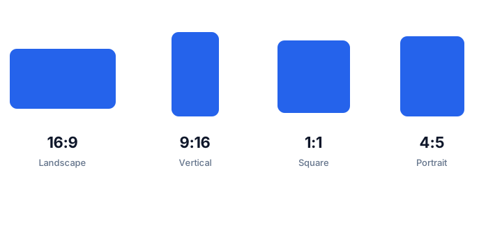
The ten ratios you are most likely to meet across screens, cameras and social platforms. Each one links to a dedicated calculator with resolution tables and worked examples.
| Ratio | Decimal | Typical use | Guide |
|---|---|---|---|
| 16:9 | 1.778 | Television, YouTube, monitors, laptops | 16:9 guide |
| 9:16 | 0.563 | TikTok, Reels, Shorts, Stories, phone screens | 9:16 guide |
| 1:1 | 1.000 | Instagram feed, avatars, album art, app icons | 1:1 guide |
| 4:3 | 1.333 | Tablets, Micro Four Thirds cameras, older TV, projectors | 4:3 guide |
| 3:2 | 1.500 | 35mm film, DSLR and mirrorless stills, 6 × 4 prints | 3:2 guide |
| 2:3 | 0.667 | Portrait photos, book covers, tall web cards | 2:3 guide |
| 4:5 | 0.800 | Instagram portrait posts, 8 × 10 prints | 4:5 guide |
| 21:9 | 2.333 | Ultrawide monitors, cinematic editing, DAW layouts | 21:9 guide |
| 16:10 | 1.600 | MacBook and business laptops, 1920 × 1200 monitors | 16:10 guide |
| 2.39:1 | 2.390 | Anamorphic cinema, Scope trailers, film-look video | 2.39:1 guide |
Looking for a calculator built specifically for your display? The Screen Ratio Calculator turns any monitor, laptop, TV or phone resolution into a simplified ratio with a live preview and copyable CSS.
Common Resolutions
Common resolutions and the aspect ratio each one reduces to. If a resolution in this table matches yours, the calculator above will confirm it in one step.
| Resolution | Name | Ratio | Typical device |
|---|---|---|---|
| 640 × 360 | nHD | 16:9 | Small web video and embeds |
| 1280 × 720 | HD 720p | 16:9 | Streaming and video thumbnails |
| 1366 × 768 | WXGA | ≈16:9 (683:384) | Budget and older laptops |
| 1600 × 900 | HD+ | 16:9 | Entry-level laptops |
| 1920 × 1080 | Full HD 1080p | 16:9 | Monitors, TV, YouTube uploads |
| 2560 × 1440 | QHD 1440p | 16:9 | Gaming and work monitors |
| 3840 × 2160 | 4K UHD | 16:9 | Modern televisions and cameras |
| 1920 × 1200 | WUXGA | 16:10 | 24-inch productivity monitors |
| 2560 × 1600 | WQXGA | 16:10 | MacBook Pro displays |
| 2880 × 1800 | Retina | 16:10 | MacBook Pro scaled desktop space |
| 800 × 600 | SVGA | 4:3 | Legacy projectors |
| 1024 × 768 | XGA | 4:3 | Legacy monitors and classroom projectors |
| 4032 × 3024 | iPhone photo | 4:3 | Phone camera full-sensor output |
| 6000 × 4000 | 24 MP full frame | 3:2 | DSLR and mirrorless stills |
| 3440 × 1440 | Ultrawide QHD | ≈21:9 (43:18) | Ultrawide desktop monitors |
| 1080 × 1080 | Social square | 1:1 | Instagram and Facebook feed posts |
| 1080 × 1350 | Portrait post | 4:5 | Instagram portrait feed posts |
| 1080 × 1920 | Vertical Full HD | 9:16 | TikTok, Reels, Shorts, Stories |
| 2048 × 858 | DCI 2K Scope | ≈2.39:1 (2.387) | Digital cinema delivery |
| 4096 × 2160 | DCI 4K | 256:135 (≈1.90:1) | Cinema DCP masters |
How Aspect Ratio Works
A frame is a comparison of two numbers
An aspect ratio compares width to height and ignores size completely. That is the whole idea. A 1920 × 1080 video and a 3840 × 2160 video look identical in shape because both are 16:9, even though one contains four times as many pixels. When you scale a frame up or down and keep the ratio, nothing about the picture changes except how many pixels describe it.
Why ratios get simplified
Ratios describe proportions, not pixel counts. Any pair of numbers with the same quotient describes the same shape, so 1920:1080, 192:108 and 16:9 are three ways of writing one ratio. Dividing both numbers by their greatest common divisor gives the smallest whole-number form, which is the version people actually use. The calculator above shows the divisor it applied, so you can follow the reduction.
Ratio is not resolution
These two ideas are constantly confused. Resolution is the pixel count — how much detail the frame can hold. Ratio is the shape. Changing the ratio changes which parts of the frame exist; changing the resolution changes how much detail each part carries. That is why cropping a photo to a new ratio loses content but not sharpness, while stretching it to a new ratio keeps every pixel and ruins the picture.
When a ratio does not reduce to a common value
Not every frame is a standard shape. A 1366 × 768 laptop panel is sold as 16:9 but is really 683:384, about 0.05% wider than the standard. A 3440 × 1440 ultrawide monitor is called 21:9 but is actually 43:18. The calculator reports the closest common ratio together with how far away it is, so you can tell a true standard frame from a near miss.
How to calculate aspect ratio from width and height
To find the aspect ratio of any width and height, run the two numbers through the steps below. The calculator at the top of this page does the same reduction and shows the divisor it used.
The three-step method
- Divide the width by the height to get the decimal ratio. For 1920 × 1080 that is 1.777…
- Find the greatest common divisor of the two numbers. For 1920 and 1080 it is 120.
- Divide both numbers by that divisor to get the smallest whole-number ratio: 1920 ÷ 120 = 16 and 1080 ÷ 120 = 9, so the ratio is 16:9.
Worked example: 1920 ÷ 120 = 16 and 1080 ÷ 120 = 9, so 1920 × 1080 is 16:9 (120 is the greatest common divisor). Once you determine the aspect ratio this way, you can resize to it with the converter above.
The same calculation written out
gcd(1920, 1080) = 120
1920 / 120 = 16
1080 / 120 = 9
ratio = 16:9
decimal = 1920 / 1080 = 1.778
Going the other way: from a ratio to a size
When you know the ratio and one dimension, the missing side is a single division followed by a multiplication. For 16:9 at 1920 pixels wide: 1920 ÷ 16 = 120, then 120 × 9 = 1080. The same routine works for any ratio, including decimal ones — for 2.39:1 at 1920 wide, 1920 ÷ 2.39 = 803, so the anamorphic frame is 1920 × 803.
Why the calculator refuses decimals
Aspect ratios are built from whole pixels, because a screen cannot display half a pixel. If a width of 1920.5 were rounded silently to 1921, the reported ratio would be slightly wrong and the error would be invisible in the interface. Instead of quietly rounding, this calculator rejects decimal input and tells you why — so the ratio it reports is the true reduced form of what you typed.
What people use this for
Five everyday jobs where knowing the exact shape first saves a re-export later.
Fitting a video to a platform
Every platform specifies a pixel size, not a vague shape. YouTube wants 1920 × 1080, Reels and Shorts want 1080 × 1920, and Instagram's feed portrait is 1080 × 1350. Enter the size you have and the target ratio you need, and the numbers tell you whether you are cropping away a quarter of the frame — or two thirds of it — before you sit down to edit.
Cropping a photo without guessing
A crop is capped by whichever side is shorter. From a 3000 × 2000 photo the largest square you can take is 2000 × 2000; anything larger is upscaled rather than genuinely recovered. Checking that ceiling first avoids the most common print and listing mistake: a square that looks sharp on screen and soft in the hand.
Setting a responsive element in CSS
A single aspect-ratio declaration keeps an embed, a card or a hero image the right shape at every width, and it removes the layout shift that happens when an image loads without reserved space. Copy CSS gives you the declaration already reduced to whole numbers.
Checking a monitor or laptop panel
Marketing labels are rounded. A 3440 × 1440 ultrawide is sold as 21:9 but reduces to 43:18, and a 1366 × 768 laptop sold as 16:9 is really 683:384. The calculator reports the exact reduction alongside the closest common ratio, so you know whether a wallpaper or a crop built on the round number will actually land flush.
Printing without an unexpected trim
Print sizes are ratios in inches. Standard photo prints are almost all 3:2, so a 4:3 or 16:9 file gets trimmed at the lab. Working out the crop beforehand — rather than discovering it on the receipt — is the difference between the frame you composed and the frame you get.
Guides by Ratio
A detailed page for every common ratio, each with its own resolution table, worked calculation and FAQ.
- 16:916:9 remains one of the most common widescreen aspect ratios for TVs, video platforms, monitors and desktop displays.
- 9:169:16 is a common full-screen vertical format used by TikTok, Instagram Reels, YouTube Shorts, Snapchat and many Stories placements.
- 4:34:3 is the original television and computer-display shape, and it has not gone away.
- 1:1A 1:1 frame is a perfect square: the width and the height are identical.
- 16:1016:10 is the productivity-friendly widescreen ratio used by MacBook displays, many business laptops and 1920 × 1200 monitors.
- 21:921:9 is a common marketing label for ultrawide desktop displays, and it is sometimes used loosely for the letterboxed shape of cinema releases as well.
- 3:23:2 is the native shape of 35mm film and of the full-frame, APS-C and most mirrorless sensors built to match it.
- 4:54:5 is a common portrait format for Instagram feed posts and other social content.
- 2:32:3 is the portrait orientation of 3:2, the shape a camera produces when you turn it upright.
- 2.39:12.39:1 is the wide anamorphic shape commonly associated with cinema releases.
Guides & Articles
Longer reads for the questions a calculator cannot answer on its own — which ratio each platform expects, how to set a ratio inside your editing software, and how ratio, resolution and DPI differ.
- Social Media Ratios 2026The complete 2026 aspect ratio cheat sheet for Instagram, TikTok, YouTube, Facebook, LinkedIn, Pinterest and X.
- Set a Ratio in Your EditorStep-by-step instructions for setting or changing the aspect ratio of an image or video in Photoshop, Premiere Pro, Canva and CapCut, plus how to avoid distortion.
- DPI vs Resolution vs RatioA plain-English explanation of DPI, resolution and aspect ratio, how the three relate, and why confusing them causes blurry prints and distorted images.
- 16:9 vs 16:10 vs 21:9 MonitorsA practical comparison of 16:9, 16:10 and 21:9 monitors — screen space, gaming, productivity and which ratio fits your actual use case.
Foldable Phones
Foldable phones carry two screens with two different ratios. These pages list the inner and outer resolutions and ratios of the current foldables, and how to size a wallpaper for each.
- Foldable Phone Aspect Ratios & Screen ResolutionsHow foldable phone screens differ: inner vs outer display ratios, resolutions and wallpaper dimensions for the iPhone Duo, Galaxy Z Fold7 and Galaxy Z Flip7.
- iPhone Duo Aspect Ratio & Screen ResolutionsThe iPhone Duo inner and outer display resolutions and aspect ratios, plus how to size a wallpaper for each screen.
- Galaxy Z Fold7 Aspect Ratio & Screen ResolutionsThe Galaxy Z Fold7 main and cover display resolutions and aspect ratios, plus how to size a wallpaper for each screen.
- Galaxy Z Flip7 Aspect Ratio & Screen ResolutionsThe Galaxy Z Flip7 main and cover screen resolutions and aspect ratios, plus how to size a wallpaper for each.
Platform sizes
The exact pixel size each platform asks for, and the part of the frame its own interface draws over — Stories and pins, video thumbnails, profile banners and profile headers, on Instagram, YouTube, X, Pinterest and LinkedIn.
- Instagram StoryA Story fills the whole phone screen, and the only frame that does so without padding or cropping is 1080 × 1920 — the 9:16 portrait shape.
- YouTube Thumbnail1280 × 720 is the thumbnail size YouTube asks for, and 16:9 is the shape of every player.
- X Header1500 × 500 at 3:1 is the header size X asks for, but that canvas is the most deceptive on any social platform.
- Pinterest PinPinterest is the one major platform that rewards a tall image rather than a vertical video frame.
- LinkedIn Profile banner1584 × 396 at 4:1 is the LinkedIn profile banner size — a strip wider than any other profile header on a major platform.
- TikTok VideoTikTok shows one clip at a time on a full handset screen, so the only file that fills it edge to edge is 1080 × 1920 — the 9:16 portrait rectangle.
- Instagram Feed postThe feed is the one Instagram placement where the shape is a real decision.
- YouTube Channel bannerA channel banner is one file shown on four kinds of screen, and each one displays a different slice of it.
- X Post imageX does not show a post image at the shape you uploaded.
- Facebook Page coverAsk what size a Facebook cover photo is and you will be told 851 × 315.
Frequently asked questions
How do I calculate an aspect ratio?
Divide the width by the height to get the decimal ratio, then reduce the two numbers by their greatest common divisor. A 1920 × 1080 frame divides to 1.777, and because the greatest common divisor of 1920 and 1080 is 120, the reduced ratio is 16:9. The calculator above does both steps as you type.
What does 16:9 mean?
It means the frame is sixteen units wide for every nine units tall, which is a decimal value of about 1.778. Any width that is roughly 1.78 times its height is a 16:9 frame, whether it is 640 × 360 or 3840 × 2160.
Is 1920 × 1080 exactly 16:9?
Yes. 1920 ÷ 1080 = 1.777…, which is exactly 16 ÷ 9. The greatest common divisor of 1920 and 1080 is 120, and dividing both numbers by 120 gives 16 and 9.
What is the difference between aspect ratio and resolution?
Aspect ratio describes shape; resolution describes how many pixels fill that shape. 1920 × 1080 and 3840 × 2160 have exactly the same 16:9 shape but four times the pixel count, so they look identical in proportion and very different in sharpness.
How do I resize an image without changing its aspect ratio?
Use the Resize by Ratio tab. Enter the ratio you want to keep — 16:9, 4:3 or any custom value — then type either the new width or the new height. The other dimension is calculated for you, so the frame never stretches.
What aspect ratio is Instagram?
Instagram uses several. The profile grid and square posts are 1:1, feed posts can be portrait at 4:5, and Reels, Stories and full-screen vertical video are 9:16. A 9:16 upload is cropped to a squarer shape in the feed grid.
What is a 2.39:1 aspect ratio?
It is the wide anamorphic shape commonly used for cinema releases. The frame is 2.39 times wider than it is tall, so on a 16:9 television it is shown with letterbox bars at the top and bottom. The older label for the same family of frames is 2.35:1.
Does cropping to a different aspect ratio reduce image quality?
Cropping removes pixels, so the delivered file has a lower pixel count — but the pixels that remain are unchanged, not degraded. Stretching is what damages quality, because it invents new pixels and distorts the subject.
How do I write an aspect ratio in CSS?
Use the aspect-ratio property: aspect-ratio: 16 / 9; The numbers may be separated by a slash with spaces around it, and decimals are allowed — for example aspect-ratio: 2.39 / 1; The Copy CSS button in the calculator produces this line for you.
Embed this calculator on your site
Add a free, live aspect ratio calculator to any page in one line of code - no account, no API key, no ads. Every embed credits the tool with a Powered by AspectCalc link, so your readers always know where it came from. See the full embedding guide for height and styling options.
<div class="aspectcalc-embed" style="max-width:100%">
  <iframe id="aspectcalc-frame" src="https://aspectcalc.com/embed?h=640"
          width="100%" height="700" style="border:0;border-radius:12px"
          loading="lazy" title="AspectCalc aspect ratio calculator"></iframe>
  <p style="margin:8px 0 0;font:13px/1.4 system-ui,sans-serif;color:#64748b;text-align:center">Powered by <a href="https://aspectcalc.com/" style="color:#2563eb;text-decoration:none">AspectCalc</a> - free aspect ratio calculator</p>
</div>
<script>
  // Optional: grow the frame to the widget's real height.
  // Delete this whole block to keep a fixed-height frame instead.
  addEventListener('message', function (e) {
    if (e.origin !== 'https://aspectcalc.com') return;
    if (!e.data || e.data.type !== 'aspectcalc-height') return;
    var f = document.getElementById('aspectcalc-frame');
    if (f) f.style.height = e.data.height + 'px';
  });
</script>
The frame starts at a fixed height, so your layout never
jumps. Resize it with ?h= - for example
https://aspectcalc.com/embed?h=520 - or keep the small script in the
snippet and the frame will follow the widget's real height instead.