4:3 Aspect Ratio Calculator
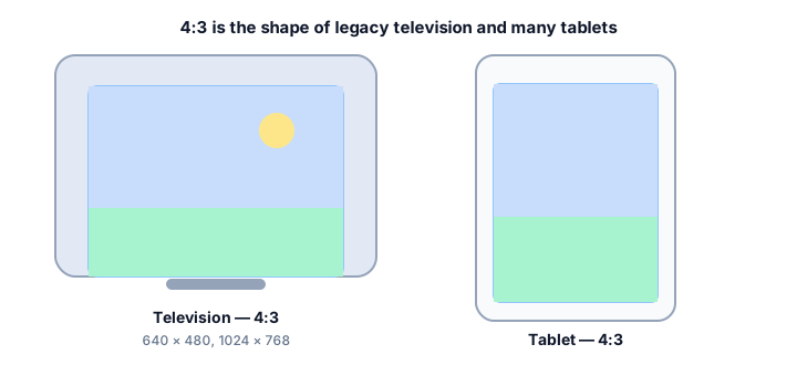
4:3 is the original television and computer-display shape, and it has not gone away. Tablets, presentation decks, Micro Four Thirds cameras and scanned documents all still produce 4:3 frames. Enter a width and height below to check whether it reduces to 4:3, or resize to a new 4:3 resolution.
4:3 Calculator
The ratio is pre-filled. Change either dimension and the other one follows.
- Fraction
- —
- Closest common ratio
- —
- Reduced by
- —
Custom Ratio — pick a preset or type your own
- New size
- —
- Total pixels
- —
- CSS
aspect-ratio: —;
Both fields are live. Edit New Width and the 4:3 height recalculates instantly; edit the height and the width follows. The derived dimension is rounded to the nearest whole pixel, while the value you typed is not altered.
Recently used sizes
Saved in this browser only. Click a size to load it back into the calculator.
Common 4:3 resolutions
8 standard 4:3 sizes, from 320×240 at the small end of the range up to 4032×3024 at the top.
| Resolution | Name | Typical use |
|---|---|---|
| 320 × 240 | QVGA | Legacy interfaces, sprites |
| 640 × 480 | VGA | Old web video, retro displays |
| 800 × 600 | SVGA | Projectors, older slides |
| 1024 × 768 | XGA | Legacy monitors, projectors |
| 1280 × 960 | Quad VGA | Presentations, scanned pages |
| 1600 × 1200 | UXGA | Photo editing, documents |
| 2048 × 1536 | QXGA | High-resolution scans |
| 4032 × 3024 | iPhone camera | Photos from the phone's main sensor |
What is 4:3?
A 4:3 frame is four units wide for every three units tall, a decimal value of about 1.333. It is a noticeably squarer rectangle than 16:9, which is why older television footage looks boxy next to a modern broadcast.
The ratio came from early film stock and was carried into cathode-ray televisions because the first picture tubes were built to match it. Computer monitors inherited the same shape, and for roughly fifty years the great majority of screens were 4:3. The shift to 16:9 in the 2000s was driven by widescreen film and by the desire to show letterboxed movies without wasting tube space, not by any change in how people use screens.
How to calculate 4:3
Reducing a 4:3 resolution to its simplest form is quick, because VGA-derived sizes share large common factors: 1600 and 1200 reduce by 400, while 640 and 480 reduce by 160.
- Divide the width by 4.
- Multiply that result by 3 to get the matching height.
- If the width does not divide evenly by 4, divide by 3 instead and multiply by 4 to get the width from a known height.
Worked example
From 1600 pixels wide: 1600 ÷ 4 = 400, and 400 × 3 = 1200, so the matching size is 1600 × 1200. For a 640-pixel width, 640 ÷ 4 = 160 and 160 × 3 = 480, giving the classic 640 × 480. The iPhone camera works the same way in reverse: a 4032 × 3024 photo is 4:3 because 4032 ÷ 4 = 1008 and 1008 × 3 = 3024.
Common mistakes with 4:3
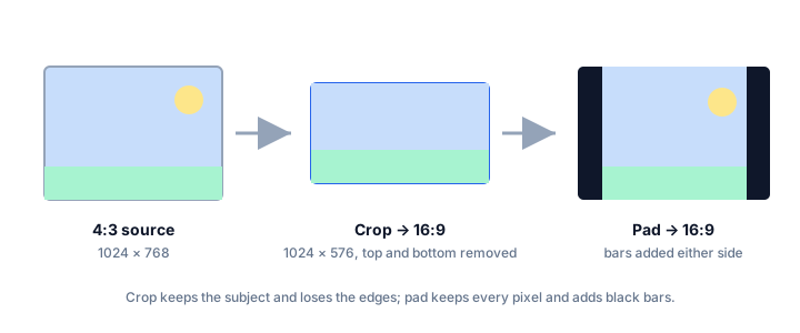
People often assume every "old" photo or classic TV clip is exactly 4:3, but sensor and format variations mean some legacy footage is closer to 1.33 without landing on it precisely. The more damaging mistake is stretching 4:3 footage to fill a 16:9 frame instead of pillarboxing (adding side bars) or cropping — stretching distorts every face and object in the shot, making people look wider and shorter than they actually are.
How 4:3 compares to its neighbours
Closest in shape is 3:2 at 1.500 — dSLR and mirrorless stills, 35mm film. The decimal value, not the size, is what changes.
| Ratio | Decimal | Feel | Typical use |
|---|---|---|---|
| 1:1 | 1.000 | Narrower | Square social posts, album art |
| 4:3 | 1.333 | — | Legacy TV, tablets, projectors |
| 3:2 | 1.500 | Wider | DSLR and mirrorless stills, 35mm film |
Worked resize example
For a 4:3 frame at 1024 pixels wide: 1024 ÷ 4 = 256, then 256 × 3 = 768. That gives 1024 × 768 — XGA, the standard legacy monitor and classroom-projector resolution, and an exact 4:3 frame.
Type your own numbers into the 4:3 calculator above and it will show the same division, plus the reduced ratio and the CSS to copy.
Common uses of 4:3
- iPad and Android tablet screens, several of which remain close to 4:3.
- Micro Four Thirds and many compact cameras, whose native sensor output is 4:3.
- PowerPoint decks set to the older 10 × 7.5 inch slide size.
- Scanned pages, forms and PDF renders that keep the original document proportions.
- Retro game emulation and pixel art, where the source material was authored in 4:3.
- Educational and archival video that has not been re-framed for widescreen.
4:3 FAQ
Is 4:3 the same as 1.33:1?
Effectively yes. 4 ÷ 3 = 1.333…, and the academic film notation 1.33:1 describes the same rectangle. The two notations are used interchangeably for television and early cinema.
How do I put 4:3 video into a 16:9 project without stretching it?
Do not stretch it. Scale the 4:3 clip until its height matches the 16:9 frame, then either accept pillarbox bars on the sides or crop the top and bottom. Stretching changes the ratio and makes everyone look wider than they are.
What is the closest 4:3 size to 1920 wide?
1920 ÷ 4 = 480, and 480 × 3 = 1440, so 1920 × 1440 is the exact 4:3 partner of a 1920-pixel width. It is taller than 1080, so a 1920-pixel 4:3 export needs a frame 360 pixels taller than a 16:9 one.
Does the iPhone shoot in 4:3?
Usually, yes. The main camera sensor is 4:3, so 4032 × 3024 is the full-sensor output. Selecting the 16:9 option crops the top and bottom of that frame rather than capturing more width.
Embed this 4:3 calculator
Add a free, live aspect ratio calculator to any page in one line of code - no account, no API key, no ads. Every embed credits the tool with a Powered by AspectCalc link, so your readers always know where it came from. See the full embedding guide for height and styling options.
<div class="aspectcalc-embed" style="max-width:100%">
  <iframe id="aspectcalc-frame" src="https://aspectcalc.com/embed?h=640"
          width="100%" height="700" style="border:0;border-radius:12px"
          loading="lazy" title="AspectCalc aspect ratio calculator"></iframe>
  <p style="margin:8px 0 0;font:13px/1.4 system-ui,sans-serif;color:#64748b;text-align:center">Powered by <a href="https://aspectcalc.com/" style="color:#2563eb;text-decoration:none">AspectCalc</a> - free aspect ratio calculator</p>
</div>
<script>
  // Optional: grow the frame to the widget's real height.
  // Delete this whole block to keep a fixed-height frame instead.
  addEventListener('message', function (e) {
    if (e.origin !== 'https://aspectcalc.com') return;
    if (!e.data || e.data.type !== 'aspectcalc-height') return;
    var f = document.getElementById('aspectcalc-frame');
    if (f) f.style.height = e.data.height + 'px';
  });
</script>
The frame starts at a fixed height, so your layout never
jumps. Resize it with ?h= - for example
https://aspectcalc.com/embed?h=520 - or keep the small script in the
snippet and the frame will follow the widget's real height instead.