4:5 Aspect Ratio Calculator
4:5 is a common portrait format for Instagram feed posts and other social content. It also matches the 8 × 10 inch print proportion. Use the calculator to convert a resolution to 4:5 or to resize a photo into the format before uploading.
4:5 Calculator
The ratio is pre-filled. Change either dimension and the other one follows.
- Fraction
- —
- Closest common ratio
- —
- Reduced by
- —
Custom Ratio — pick a preset or type your own
- New size
- —
- Total pixels
- —
- CSS
aspect-ratio: —;
Both fields are live. Edit New Width and the 4:5 height recalculates instantly; edit the height and the width follows. The derived dimension is rounded to the nearest whole pixel, while the value you typed is not altered.
Recently used sizes
Saved in this browser only. Click a size to load it back into the calculator.
Common 4:5 resolutions
7 standard 4:5 sizes, from 480×600 at the small end of the range up to 3200×4000 at the top.
| Resolution | Name | Typical use |
|---|---|---|
| 480 × 600 | Small portrait | Thumbnails and previews |
| 640 × 800 | Web portrait | Blog images, cards |
| 864 × 1080 | Feed portrait | Legacy Instagram portrait size |
| 1080 × 1350 | Social portrait | Instagram and Facebook feed posts |
| 1440 × 1800 | High-res portrait | Retina-quality uploads |
| 2400 × 3000 | 8 × 10 inches | Print at 300 dpi |
| 3200 × 4000 | Large print | Wall prints and posters |
What is 4:5?
A 4:5 frame is four units wide for every five units tall, a decimal value of 0.8. It is taller than square but noticeably shorter than a 9:16 phone screen.
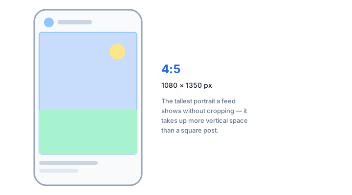
The ratio became popular because of a platform decision rather than a camera one. On a narrow phone display, a portrait post occupies more vertical space in the feed than a square one, so it holds more of the screen while scrolling. Taller formats exist, but a feed that displays 4:5 will crop anything taller, discarding the extra height you just added.
How to calculate 4:5
Because this is a portrait ratio, the usual divide-by-width routine needs adapting: the width is the smaller number, so work from whichever dimension you already know.
- If you know the width, divide it by 4 and multiply by 5 to get the height.
- If you know the height, divide it by 5 and multiply by 4 to get the width.
- Round to whole pixels, then check the size against the requirements of the platform you are uploading to.
Worked example
From 1080 pixels wide: 1080 ÷ 4 = 270, and 270 × 5 = 1350, giving the common 1080 × 1350 Instagram portrait post. From a height of 3000 pixels: 3000 ÷ 5 = 600, and 600 × 4 = 2400, producing 2400 × 3000 — which is exactly an 8 × 10 inch print at 300 dots per inch.
Common mistakes with 4:5
4:5 is sometimes confused with the "4x5" large-format film size used in view cameras, which refers to physical inches, not the same proportion as the digital 4:5 ratio used on Instagram. It's also easy to mix up with 5:4, the landscape ratio commonly used for presentation slides and some older monitors — the same two numbers, opposite orientation.
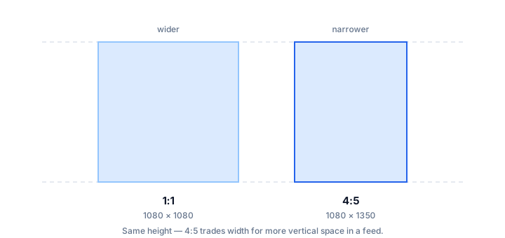
How 4:5 compares to its neighbours
Closest in shape is 3:4 at 0.750 — default phone camera photos. The decimal value, not the size, is what changes.
| Ratio | Decimal | Feel | Typical use |
|---|---|---|---|
| 3:4 | 0.750 | Slightly less tall | Default phone camera photos |
| 4:5 | 0.800 | — | Instagram portrait posts, 8 × 10 prints |
| 1:1 | 1.000 | Less tall | Square feed posts |
Worked resize example
For a print-ready portrait export at 1440 pixels wide: 1440 ÷ 4 = 360, then 360 × 5 = 1800. That gives 1440 × 1800, which prints at 4.8 × 6 inches at 300 dots per inch — the same shape as the 8 × 10 print, at roughly half the linear size.
Type your own numbers into the 4:5 calculator above and it will show the same division, plus the reduced ratio and the CSS to copy.
Common uses of 4:5
- Instagram and Facebook portrait feed posts and carousels.
- Pinterest supports several vertical formats, including 2:3, 4:5 and 9:16.
- 8 × 10 inch prints, a common portrait wall-print size.
- Mobile-first web hero sections and product pages.
- Story and Reel covers, which appear in a portrait frame in feed and grid views.
- E-commerce lookbook pages that show a full outfit or tall product.
4:5 FAQ
Why does Instagram use 4:5 instead of 9:16 in the feed?
Because the feed reserves space for the caption and interface below the image. 4:5 is the tallest ratio that fits there without being cropped, so a 9:16 upload can have its bottom cut off in the feed even though it plays in full on the Reels tab.
Is 4:5 the same as 8 × 10 inches?
Yes. 8 ÷ 10 = 0.8, identical to 4 ÷ 5. That is why photos sized for Instagram portrait posts print cleanly at 8 × 10 inches with no cropping.
Should I crop or pad to reach 4:5?
Crop when the subject fills the frame and the extra edges are expendable. Pad when the whole composition matters — for example a tall building or a full-length portrait where cutting the top or bottom would ruin the shot.
Can I use 4:5 for video?
You can, but most video players are built for 16:9 or 9:16. A 4:5 clip will be pillarboxed on a widescreen display and letterboxed on a phone. Use it for stills and for motion graphics that are read vertically, not for standard video delivery.
Embed this 4:5 calculator
Add a free, live aspect ratio calculator to any page in one line of code - no account, no API key, no ads. Every embed credits the tool with a Powered by AspectCalc link, so your readers always know where it came from. See the full embedding guide for height and styling options.
<div class="aspectcalc-embed" style="max-width:100%">
  <iframe id="aspectcalc-frame" src="https://aspectcalc.com/embed?h=640"
          width="100%" height="700" style="border:0;border-radius:12px"
          loading="lazy" title="AspectCalc aspect ratio calculator"></iframe>
  <p style="margin:8px 0 0;font:13px/1.4 system-ui,sans-serif;color:#64748b;text-align:center">Powered by <a href="https://aspectcalc.com/" style="color:#2563eb;text-decoration:none">AspectCalc</a> - free aspect ratio calculator</p>
</div>
<script>
  // Optional: grow the frame to the widget's real height.
  // Delete this whole block to keep a fixed-height frame instead.
  addEventListener('message', function (e) {
    if (e.origin !== 'https://aspectcalc.com') return;
    if (!e.data || e.data.type !== 'aspectcalc-height') return;
    var f = document.getElementById('aspectcalc-frame');
    if (f) f.style.height = e.data.height + 'px';
  });
</script>
The frame starts at a fixed height, so your layout never
jumps. Resize it with ?h= - for example
https://aspectcalc.com/embed?h=520 - or keep the small script in the
snippet and the frame will follow the widget's real height instead.